31st March 2017
The New Rules of Web Design
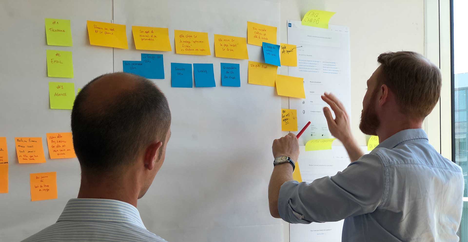
Creating a website design that works for both your business and customers is not easy to do. There are countless things that can make a difference to your website’s performance, both good and bad, and it can be easy to get overwhelmed.
While it’s unlikely you will actually be designing your website yourself, and will more than likely have a professional designing it for you, it’s always useful to bring some of those skills in house. With a little know-how, even the simplest tweaks could go a long way towards improving the user experience.
Have you ever jumped ship from a website because you simply can’t work out the navigation? Or maybe you couldn’t find what you’re looking for? Now imagine if that is what was happening on your website.
As a rule of thumb, you should aim for no more than seven items in the navigation bar. By doing so you will make the path through the website clearer and reduce the number of steps it takes for users to find what they are looking for. You should also aim to make all the navigation labels as descriptive and self-explanatory as possible. This may seem obvious, but it’s vital if you want to ensure that users don’t get lost on your site.

CTA buttons are buttons commonly used throughout a website to guide users along the correct ‘journey’. CTA buttons have one very simple goal: to ensure the user follows the correct journey, from arriving to completing the conversion.
There are quite a few design rules CTA buttons need to follow, so we’ll stick to the most important ones. First of all, the colour choice is essential. Green and orange buttons are reported to work best, but this will largely depend on the colour scheme of your website.

The CTA colour should ideally contrast with that of your primary colour. If your primary colour is green, for example, then there’s not much point having green CTA buttons, as they simply won’t stand out.
The message on the CTA should also be striking and engaging. Get rid of boring words like “submit” and “enter”, and instead try something like “reserve” or “try now”. You want your users to be excited to see what is coming next – don’t downplay yourself.
Once you’ve got your CTAs in place and working you can track their performance via Google Analytics. By setting up conversion tracking you can build an understanding of the journey a user is taking through your website and therefore the route they have taken. Without tracking how the CTAs are working it is simply guesswork.
You’ve probably heard the phrase less is more, and this couldn’t be more true for web design. White space, as it is commonly referred to as by web designers, doesn’t even have to be white! Instead, it refers to any unmarked space on a website, no matter the colour, pattern or design. It can be found between different paragraphs, between different elements or basically anywhere on the page.

By Ben Schade on Dribbble
Whitespace can not only transform the page on which it is being used, but also the business using it. While being aesthetically pleasing is one of the main benefits of white space, it can also make the contents of a page more valuable. Whitespace is proven to provide improved comprehension of a page, increased focus on main points and an increased interaction rate, making it a powerful web design tool.
If “a picture paints a thousand words”, a good website gives you a whole novel. With the use of good quality imagery, a website’s message can be much more easily conveyed and remembered by users.
Given that research shows 90% of all information we perceive and gets transmitted to our brains is visual, it’s not surprising that good quality imagery has the power to grab our attention, trigger emotions and even compel us to take action. Many websites offer free stock imagery for you to use such as Pexels or Unsplash.
Most business owners won’t need telling that social media has taken over the world. Approximately 22% of the world’s entire population is now on Facebook; there are 800 million monthly active users on Instagram; and 100 million daily active users on Twitter. These figures are so huge they are almost incomprehensible and can lead some people to simply avoid engaging with social media altogether.

While you realistically aren’t going to reach 22% of the world’s population on Facebook, reaching a large audience is not inconceivable. By including social media buttons in your website’s design – whether that be a “follow” button or a “share” button – you are giving people a chance to boost your presence even further if they like what they see.
I hope you have found this blog informative and has shown you that sometimes in web design the smallest tricks may go a long way.
Quick Tips to Improve Your Existing Website Without a Full Redesign

4 Reasons to Re-Design Your E-Commerce Website

Increase Form Conversion With UX Design
Conversion-led with proven R.O.I. success
Instant results, long-lasting impact.
Vast experience
Established since 2003, servicing local businesses and global brands.
Friendly and proactive support
We build personal connections, ensuring your brand is in safe hands.
We'd love to discuss your project
Tell us about your project and get a quote.
Are you in need of more business?
We can double your conversion rates by optimising the user experience
Get a FREE UX audit on your website