4th April 2019
6 UX Design Myths That Need To Go
Many of us already feel fluent – we know before we even load the page what navigation button we’re looking out for to get the information we want. Rounded Call To Action buttons, drop-down menus, clickable carousels featuring the best and most recent output, a contacts page with a Google Maps plugin – the list of what we expect in a website goes on.
Being able to read the web goes further than just knowing where the information you want is going to be, it also relates to things like security, where web users have learnt to spot ‘spammy’ looking websites which look like they could be a front for phishing and data stealing. This means being able to analyse fonts, often judging typography and text layout, as well as images; stock images are a dead giveaway nowadays, as are low-res and badly cropped or positioned images. Blue hyperlinks, which for years were the default for indicating a clickable link, have become associated with untrustworthy sources where you’re only ever one click away from being thoroughly bombarded with pop-up windows.
The role of spam has given web designers standards of what not to look like – an e-commerce site must take extra special care when designing its user interface to ensure that customers feel safe entering their card details and sharing other personal information like addresses and contact details. For many web designers, therefore, a guiding light is the appearance of legitimacy. This is in itself restrictive, as it binds certain kinds of builds to an unspoken set of design rules. This makes the web a fascinating object of study in its own right, however: taken from a birds-eye-view, all web designers are, consciously or otherwise, working with each other to create a universal language for reading the unwritten.

Adding to this is the growing number of people who surf the web almost exclusively on mobile. This has blurred the line between apps, websites, and software, as well as bringing with it new standardisation rules. Bootstrap pages are a clear example of this influence; a design concept that is built around flicking up with your thumb on a touch screen to scroll through a page, it has transferred equally well to desktop-based navigation using a mouse wheel.
This moves us on to one of the key influences in branding- that is, tidying up a presentation with a general emphasis on minimalism. This has also been a consequence of sites wanting to avoid, where possible, too much PPC advertising on their pages. Being able to have a clean webpage, free from banner ads and the like, is in its own way a signifier of legitimacy. In B2C relations, this shows the customer that you don’t need to cover your page in ads; your priority is their experience. This of course, in reality, has more to do with the chosen business model than anything, but it is always the perception that matters.

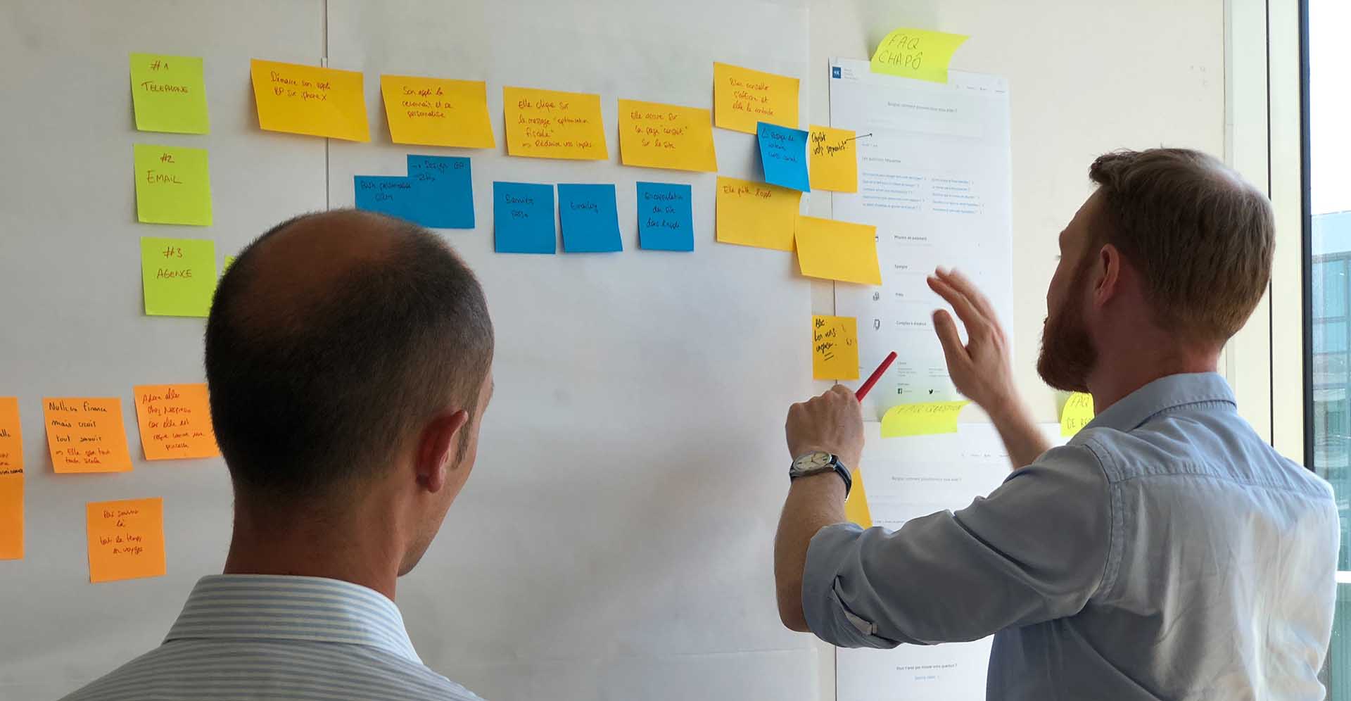
There is a flipside to this however – if designers build with too much ‘assumed knowledge’ on behalf of their users, then they can end up with unintuitive builds. This is why there’s no getting past vigorous UX testing, somethig which we at Angle have always taken seriously. This is an area which is open to innovation, as we have seen over the past few decades as the web has evolved. New standards have been forced by new technologies; touch-screen becoming the de-facto smartphone interface has probably been the greatest disruptor to UX in our time, with all other artistic considerations falling in line behind the practical needs of touch-screen interfaces. VR and AR, when (if) they ever hit the mainstream consumer tech market, will probably be the next.
In the meantime, it’s important for web designers to understand their users, and not to assume that they have the same level of web literacy as someone who works in the industry: understand your users, and help them understand your designs.

28th August 2015
What a Web Designer Does (that you may not be able to)

Why is Accessibility in Web Design Important and How Can You Achieve it?
22nd January 2019
The Benefits of Using Imagery in Web Design
Conversion-led with proven R.O.I. success
Instant results, long-lasting impact.
Vast experience
Established since 2003, servicing local businesses and global brands.
Friendly and proactive support
We build personal connections, ensuring your brand is in safe hands.
We'd love to discuss your project
Tell us about your project and get a quote.
Are you in need of more business?
We can double your conversion rates by optimising the user experience
Get a FREE UX audit on your website